
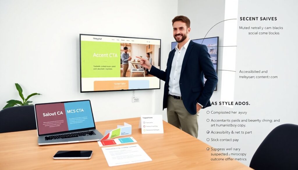
Thefairypixel.com design shows clear creative intent and a focused portfolio. This review analyzes visual identity, content flow, and interaction choices. It highlights strong points and practical fixes. The goal is to give a concise, usable redesign guide for site owners and designers.
Key Takeaways
- Thefairypixel.com design features a strong visual identity with consistent typography and color choices that enhance readability and brand unity.
- Improving the portfolio with outcome metrics and adding client type filters can help visitors assess fit and find relevant projects faster.
- Addressing accessibility by verifying keyboard focus, providing explicit form labels, and disabling auto-advance sliders will improve usability for all users.
- Optimizing the mobile experience through better spacing, compressed hero images, and a persistent contact bar can boost user engagement and conversion.
- Implementing an accessibility checklist and performance monitoring plan will ensure ongoing site quality and efficient loading times.
- A clear value proposition near the homepage top will communicate the studio’s services effectively and reduce bounce rates.
Visual Identity, Typography, And Color System
Thefairypixel.com design presents a defined brand mark and a consistent logo treatment. The site uses a single display logo and a compact wordmark on most pages. The designer pairs a geometric sans for headings with a humanist sans for body text. This choice gives headings weight and body text clarity. The type scale favors larger headings and medium body size, which aids scan reading.
The color system on thefairypixel.com design leans on a saturated accent and muted neutrals. The accent color drives call-to-action buttons and link states. The neutral palette supports image crops and content blocks. The contrast meets basic legibility for most text sizes, but some secondary text falls near the minimum ratio. The reviewer recommends a slightly darker neutral for small text and an accessible accent shade for critical actions.
The imagery uses consistent filters and tight crops. The photos and illustrations share a warm tone and modest saturation. This coherence helps the brand read as unified. The reviewer suggests adding a modular asset library that lists logo use, color hex codes, and type scales. This library will help future updates and external partners keep thefairypixel.com design consistent.
Information Architecture, Content Strategy, And Portfolio Presentation
Thefairypixel.com design arranges content around projects and services. The navigation shows Work, About, Services, and Contact. The site uses project pages that combine case study text with large visuals. This layout helps viewers focus on craft and outcomes.
The content strategy favors visual storytelling over data. The case studies emphasize images and short captions. The reviewer finds value in adding outcome metrics and a brief challenge-method-results paragraph on each project. This change will let potential clients quickly judge fit.
The portfolio grid uses mixed-size cards. The pattern creates visual interest. The current filter options are limited to broad categories. The reviewer recommends adding client type and industry filters. This change will speed up discovery for users who look for similar work.
The author bios and service pages use a concise tone. The about page shows a short timeline and select client logos. The reviewer advises a clearer value proposition near the top of the homepage. This statement should state who the studio serves and what results it delivers. A single sentence value proposition will improve conversion and reduce bounce.
Usability, Accessibility, And Interaction Patterns
Thefairypixel.com design uses clear visual affordances for primary actions. Buttons show a solid fill and hover states. Links use underlines on focus. The site relies on predictable interaction patterns that most users recognize.
But, a few usability gaps appear. The keyboard focus order sometimes skips non-critical widgets. The reviewer asks that the team verify tab order and visible focus on all interactive controls. Form labels sit outside of focus for some inputs. The reviewer recommends explicit labels and ARIA where needed.
The site uses large image sliders on project pages. These sliders work visually, but they auto-advance on some pages. The reviewer suggests disabling auto-advance or adding a clear pause control. Auto movement can harm reading and accessibility.
The navigation compresses into a hamburger menu on narrow screens. The reviewer suggests adding clear labels and a visible close control to improve clarity for keyboard and screen reader users.
Thefairypixel.com design would benefit from a simple accessibility checklist. The checklist should include color contrast, keyboard support, semantic headings, and alt text for media. The team can run automated tests and a manual review with assistive tech.
Mobile Experience And Performance Optimization
Thefairypixel.com design loads quickly on modern devices. The site uses optimized images and lazy loading. These choices improve initial load time on mobile.
The mobile layout stacks content and enlarges tap targets. The reviewer notes that some interactive elements sit close to the screen edge. The team should increase padding and hit area for key buttons.
The site uses large hero images that can push content below the fold. The reviewer recommends compressing hero height on phones and prioritizing the value statement and call to action above the fold. This change will reduce scroll time to the main conversion point.
The developer set optimized image formats and a CDN. The reviewer advises adding a simple performance budget and monitoring plan. This plan should track Largest Contentful Paint, Total Blocking Time, and Cumulative Layout Shift. The team should set goals for each metric and run periodic checks.
The mobile navigation uses a compact list that reveals links on tap. The reviewer suggests keeping key contact actions persistent at the bottom of the viewport. A sticky contact bar will give users fast access to hiring or inquiry actions without extra scrolling.
Overall, thefairypixel.com design works well on small screens, but small adjustments to spacing, hero size, and persistent contact actions will lift conversion and usability.