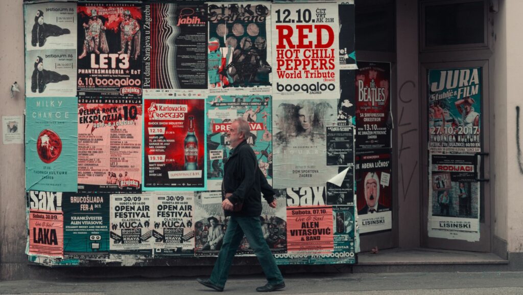
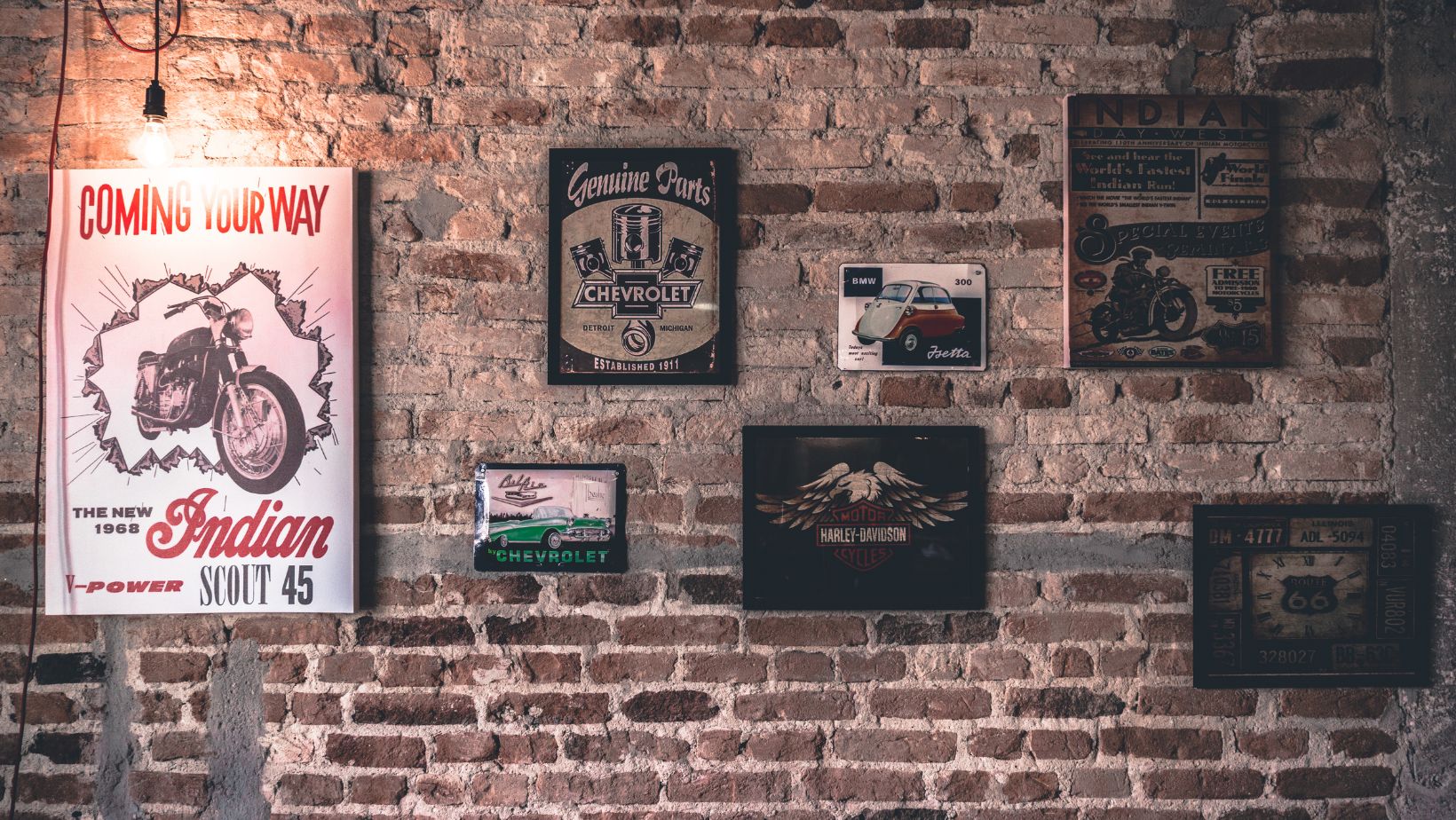
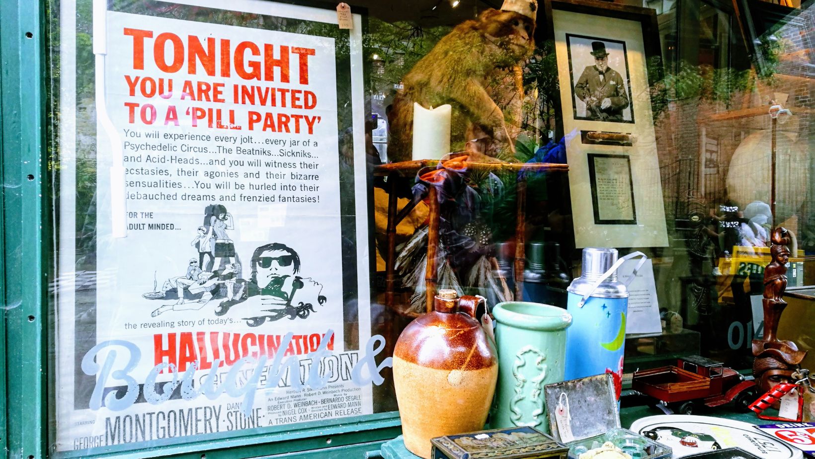
Vintage posters still have a say in digital design and there is a reason why. Their incomplete edges, the layered ink and the touchable grain evoke a feeling of nostalgia that is more human than most digital graphics. Creating a wear and tear travel advertisement or a replica of a 1960s concert flyer, it is all about the real-life texture to prevent the unnatural appearance of a flat mock up.
Posters of previous decades did not appear polished. They were printed off hastily, treated roughly, and subjected to the elements, time and handling. It is all about texture in Photoshop to re-create that layered effect and one of the most expressive sources of texture is actually in something so simple and so often ignored: hand-colored artwork.
Sourcing and Scanning Artwork
Firstly, it is useful to have base materials that have organic lines, jagged strokes and natural pressure variations. These qualities show up best in filled-in coloring pages, especially when completed with pencils, crayons, or markers. The overlaying and mixing of those tools creates a surface that will replicate the aging of real life in a much better way than the digital brushes would.
Once you have chosen a page with a high level of colour variation and texture that is evident. What may appear to be more clean to the eye, will tend to remove the raw detail that makes these overlays effective.
To maintain sharpness editing, save the scan as TIFF or high-quality PNG. When in Photoshop, crop or rotate it into usable squares or rectangles which fit the size of the poster you are dealing with.
Cleaning and Isolating Color Layers
Once imported into Photoshop, the first step is to separate the texture from the artwork’s content. Use the Desaturate tool (Shift+Ctrl+U) to remove hue and reduce the image to tonal contrast. Then apply Levels (Ctrl+L) to deepen the shadows and raise the highlights, amplifying the natural grit of pencil lines and crayon build-up.
If parts of the paper are too dominant, apply a Blend If mask via Layer Style > Blending Options. Slide the dark or light sliders while holding Alt to split the points gradually. This helps pull out mid-tone grain while letting the brighter areas fall away.
Once satisfied, duplicate the cleaned texture layer and keep one version untouched in case of over-editing. This backup gives flexibility when adjusting Blend Modes later on.
Creating Custom Overlay Presets
To save time in future projects, turn each cleaned texture into a reusable preset.
Convert the layer to a smart object, then use it to create:
- A pattern preset for quick fill layers (Edit > Define Pattern)
- A displacement map (saved as grayscale PSD) to distort poster elements realistically
- A transparent PNG overlay that can be dragged onto any new canvas
Saving these assets in clearly named folders helps maintain an efficient design workflow. Include notes on which overlays give the softest results versus those that add heavy grain. This reference becomes especially useful when designing posters across different eras—like deco, mid-century, or 90s grunge styles.
Applying Overlays to Poster Designs
Import your overlay as the uppermost file in the poster. Beginning with Multiply or Overlay Blend Mode, start with whichever Blend Mode makes the base artwork darkest. Multiply intensifies shadows and highlights scratches; Overlay makes contrast by intensifying highlights and shadows simultaneously.
Change the opacity to mellow out the harshness. Generally, the best-looking values are in the range of 35-65 per cent. To give some areas more edge, one can duplicate the layer and make the duplicate Color Burn.
Monitor the balance it can make the artwork flat or typography can be overloaded with too many stacked textures. Apply layer Masks to delete some of the texture around the key details such as logos or key visuals. This simplifies the reading of the poster and does not lose the worn look.
Enhancing with Gradient Maps and Noise
In order to make the tones consistent, add a Gradient Map adjustment layer on top of the painting. Go with warm earth tones or just a slightly desaturated colour ramp to give a sun-faded feel. Modify the shadows and mid tones to draw the entire design into a more consistent palette.
Textures and printed elements can be united by adding Film Grain or a slight Noise (Filter > Noise > Add Noise) all over the composition. The believable age is provided by Gaussian, monochromatic noise at approximately 2-5 percent that does not make the poster too artificial.
Exporting and Sharing the Final Piece
After completing the poster, one should export both the web and print. Save a JPG to 300 dpi to print it and a compressed PNG or JPG at 72 dpi to share it on the internet. In order to maintain the quality of texture, do not flatten the image until the last step.
Designers who want to share overlays or who create group projects may bundle clean texture layers in a resource pack. Add usage notes and layer settings so that others can apply them regularly. In case the textures are derived out of physical art work, such as coloured pages, make sure to mention the source or credit, so that the originality remains.
Finally, the recycling of real-life texture makes digital work come to life. What begins as a colouring session by a child or an impromptu creative break can be the basis of a rich layered poster art that is noticeable even in a screen dominated world.