
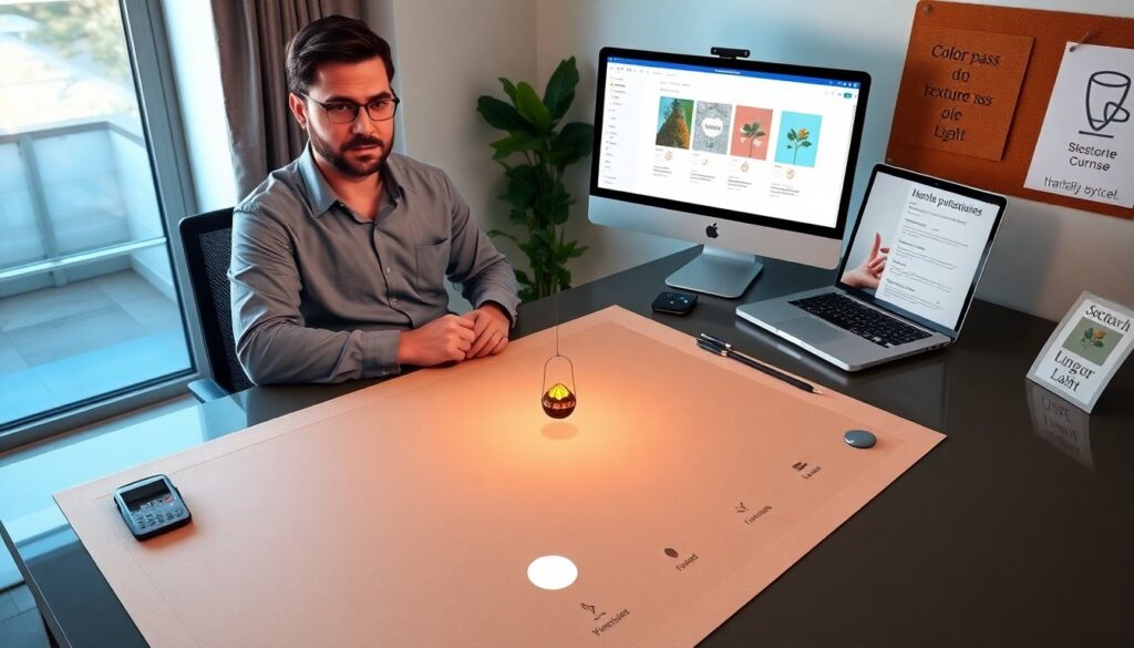
The article lists creative techniques thefairypixel. com uses to make whimsical digital art. It shows clear steps, simple rules, and practical tips. The reader will learn color choices, texture methods, composition rules, and workflow templates. Each sentence gives a single idea and a direct action.
Key Takeaways
- TheFairyPixel.com merges fantasy and minimalism by focusing on a single motif with limited props to create clean, emotive digital art.
- Color palettes are chosen by mood first, using one dominant hue, supporting hues, and an accent to highlight focal points effectively.
- Depth is achieved by layering base color, texture, and selective light, with careful blending to maintain a tactile yet minimal look.
- Custom brushes and overlays, like noise and scatter brushes, streamline production and help maintain a consistent aesthetic.
- Compositions are planned with visual rhythm, negative space, and subtle actions to convey a narrative within a single frame.
- A structured, repeatable workflow with layered files, templates, and checklists ensures consistent and efficient project execution.
Signature Aesthetic: Combining Fantasy With Minimalism
TheFairyPixel.com blends fantasy with minimalism to create clean, emotive art. The site pares down details, then adds a single fantasy element to shift mood. The artist selects one focal motif, such as a floating lantern or tiny creature, and centers it in a calm frame. The artist limits props to preserve negative space and to make the focal motif read clearly. The artist uses simple silhouettes and subtle line work to keep shapes readable. The artist balances whimsy by using delicate ornamentation only where the eye will rest. The technique helps viewers feel wonder without visual overload. The site repeats this method across character and landscape pieces to build a consistent brand voice. The method works for small commissions and for larger illustrative posters.
Color And Palette Strategies For Emotional Impact
TheFairyPixel.com chooses palettes by mood before choosing hues. The artist picks a dominant hue, then selects two supporting hues and one accent. The artist tests palettes at full saturation and at muted values to confirm read. The artist uses color temperature to hint at time of day and to guide emotional tone. Cool palettes suggest calm or mystery. Warm palettes suggest comfort or joy. The artist applies accent colors to the focal motif to increase attention. The artist limits color contrast in background layers to keep the main shape visible. The artist creates small palette swatches and saves them as named files for reuse. The saved swatches speed up consistent output across projects.
Texture, Layering, And Light — Practical Methods
TheFairyPixel.com builds depth by combining flat shapes with layered texture and selective light. The artist places three layers: base color, texture layer, and light layer. The base color gives the major form. The texture layer adds subtle grain, paper, or film effects to break flatness. The light layer adds highlights, rim light, or soft glows to define volume. The artist adjusts layer blending modes to find natural-looking mixes. The artist keeps texture scale small on characters and larger in backgrounds to preserve focus. The artist uses light sparingly to avoid washing out the motif. The result reads as tactile while staying minimal.
— Using Custom Brushes And Overlays
TheFairyPixel.com develops custom brushes and overlay assets to speed production and to add personality. The artist creates a noise brush for subtle grain and a scatter brush for star fields. The artist makes a paper-edge brush for hand-cut silhouettes and a soft brush for bloom. The artist saves overlay files with grain, light leaks, and vignette layers. The artist places overlays at low opacity and then narrows opacity to taste. The artist annotates each brush with use cases, such as “star scatter for night scenes” or “edge rough for paper cut.” The labeled brushes help junior artists and collaborators match the aesthetic.
Composition, Storytelling, And Visual Rhythm
TheFairyPixel.com plans composition to tell a small story in one frame. The artist sketches three thumbnail ideas and then tests each for read and balance. The artist uses a rule-of-thirds grid and a center-emphasis test to decide focal placement. The artist repeats small motifs to set visual rhythm, such as repeating leaf shapes that lead the eye into the scene. The artist varies scale to suggest distance and to make moments feel intimate. The artist places negative space to give the viewer a place to rest. The artist adds a tiny action, like a gaze or a hand gesture, to make the scene feel alive. The result makes viewers form a short narrative without extra text.
Tools, Workflow, And Reproducible Project Templates
TheFairyPixel.com uses a tight, repeatable workflow to move from idea to final file. The artist starts in a sketch document, then creates an approved layout file and a color test file. The artist uses layered PSD or Procreate files with named folders: sketch, linework, color, texture, light, overlays. The artist applies non-destructive edits with masks and adjustment layers to allow quick changes. The artist builds template files with preset canvas sizes, swatches, and export actions. The artist uses versioned filenames and a simple checklist: sketch, color pass, texture pass, light pass, export. The artist stores templates in a shared folder to enable consistent output across projects. The shared templates let multiple people reproduce the same look quickly.